Role:
Sole owner building an MVP and content designer
Skills:
Information architecture, CTA, onboarding, grammar, tone + voice, microcopy, error messages
TL;DR - Turba is an MVP I built in order to help cyclists create, share, and view group ride profiles. While building Turba, I used a content-first design approach while making product decisions. This page is dedicated to exploring the macro and micro content design thinking behind each flow. In addition to this, I authored a content style guideline for Turba to document high level content design principles.
Here’s an overview of the the UI layout of Turba.


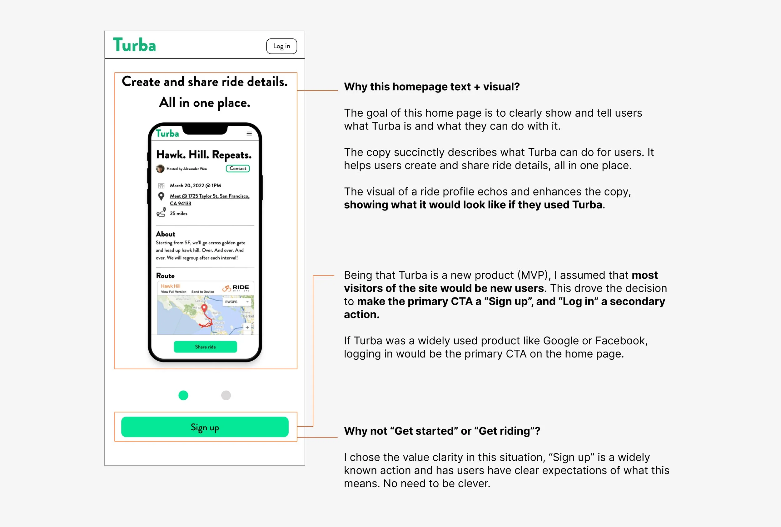
HOMEPAGE + SIGN UP/LOG IN CTAS
Objectives for Homepage:
Provide a quick overview with text + visuals to present the value of Turba/what users can do with it.
Giving prospective users a clear value + path to move forward and sign up for Turba.


SIGN UP
Objectives for both Sign up/Log in flows:
Give users a clear and frictionless path to Sign up for/Log in to Turba
Within these two flows, I prioritized simplicity and clarity over everything else. Users see Sign up/Log in processes as a requisite step to access what they want to use, the product. This is reflected in the content design of these flows. It’s minimalist by nature and explicit in what actions can take.
Utilizing clear + thoughtful language to denote user actions.
Writing in second person instead of first person to foster the feeling of conversation + utilizing progressive buttons to reduce rate of error messages.


LOG IN
Making the Log in process as simple as frictionless as possible to usher people into using Turba.


ONBOARDING
I decided to not have an onboarding flow to simplify the experience and remove unnecessary steps.
I solidified my decision on including/excluding onboarding by A/B testing flows (via clickable prototypes) with interviewees, testing one flow with onboarding and another without.
What I found: 90% of users said that not having an onboarding did not affect their ability to use Turba, nor did it cause frustration . Essentially, no onboarding flow/extra explanation was necessary to use Turba.
CREATING A RIDE
I segmented the process of creating a ride into multiple steps to make it more palatable than showing all entry fields + steps at once.
Guiding users with copy that inspires thought + action.


SHARING RIDES
Consolidating two CTAs into one primary “Share ride” button for simplicity.
I consulted with my engineer to scope the viability of custom images in link previews for each ride. I ended up moving key details to the link description to adapt to technical constraints.
Addressing edge case content decisions + formatting and standardizing calendar (ICS) exports out of Turba.
MISC CONTENT DESIGN DECISIONS
Addressing 404s and edge cases with brand voice and personality.


CONCLUDING THOUGHTS + LEARNINGS
Working as a content designer while making all product decisions allowed me to simulate working the back and forth + conversations that a full product team deals with.
Here are a few things I’d love to explore more!
Expanding on the sharing process: Currently Turba only allows to share a text description when sharing rides. I’d love to explore the possibility of sharing rides onto social media in image/visuals. This raises questions such as: Are there multiple CTAs (a text share and a social media share)? How will information be shown in a visual? What ride details will show on these visuals? Can users customize what info is shared? What implications from a technical + content design standpoint should be tested/examined?
Further testing of flows: Since Turba’s content design decisions and user flows were made using limited data from working prototypes + educated hunches, I’d want to dive into gathering data from real users to understand how users interact with the product. Here are a two flows I’d like to look more at:
Sign up/log in: Are users deterred by the need to sign up when visiting the site? This would drive data on understanding if Turba should be an easily accessible, similar to products such as When2Meet.
Ride description: Being that the ride description and the accompanying prompt text is essential for users to include helpful information on events (such as pace, potential stops, etc.), I’d like to further understand what users are including in it or even how many characters they’re writing. This would help me understand how much detail users are entering and how to prompt them using different content or visual design approaches.


