Role:
Solo Project (content design, information arch)
Timeline:
1 Day sprint/case study (July 2022)
TL;DR - Looking at Podium’s landing page, I identified ways in which they could include more context and communicate product value both in web copy + CTA clarity. I redesigned the copy and information architecture with business impact (# of clicks + leads generated) and content design thinking in mind. I sent this case study to a Sr. UX writer at Podium and learned that the company is already in talks of implementing similar changes to my suggestions. 🤩
Table of Contents 📚 :
Note: While this landing page is a marketing page, I do want to underscore that thoughtful content design can add value, be effective, and guide users with useful language in any situation. Irregardless of it’s deployed in a marketing page or in-product flow.
PROBLEM + ANALYSIS
The landing page could guide viewers with context and value to make actionable decisions.
People navigate to Podium’s landing page to learn about why their small business can succeed with Podium (empathizing with viewers’ intents). Information should be laid out in a way where the value prop of Podium leads and clear actions a viewer can take follows.
Here’s what I would change:
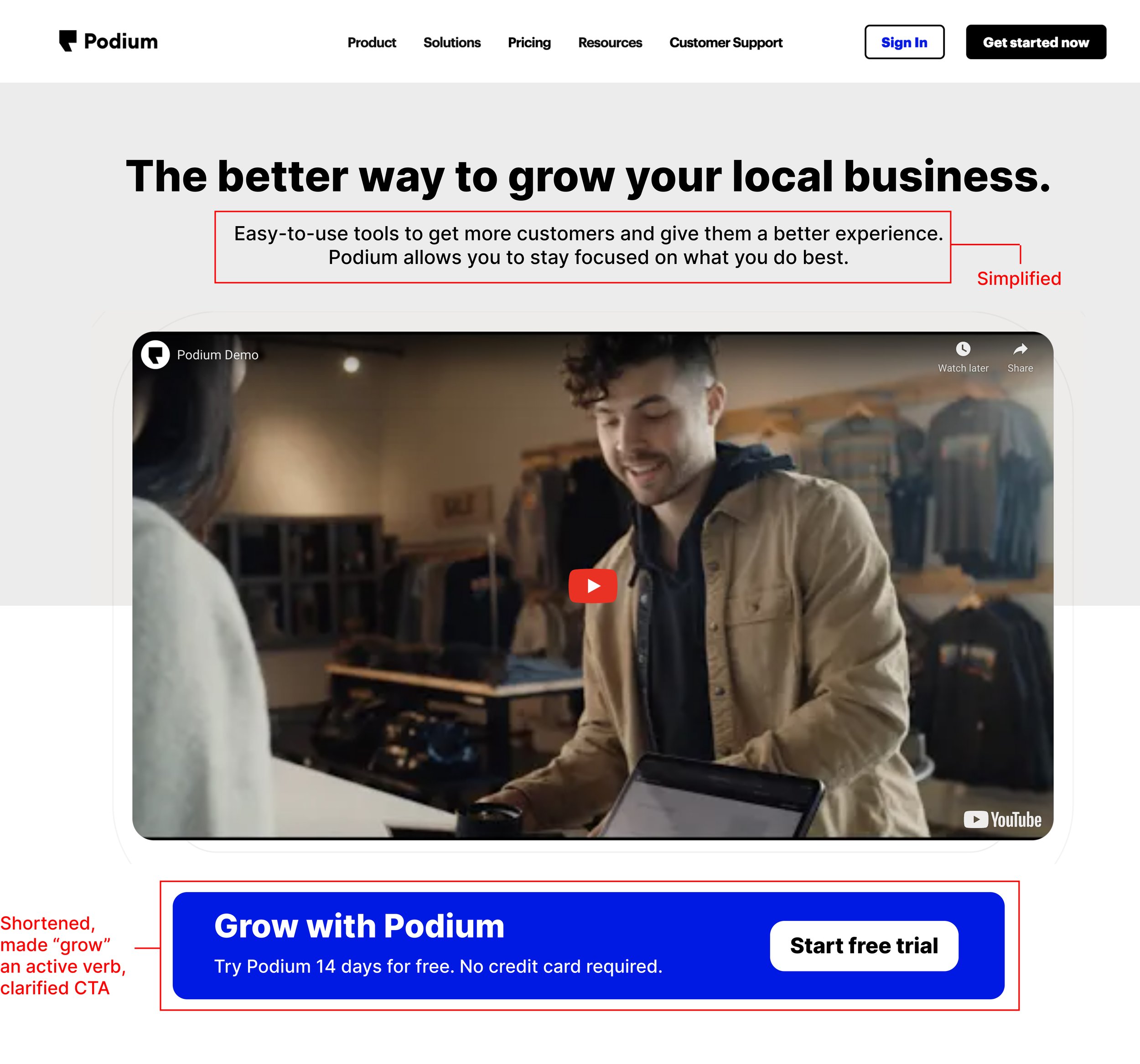
Keep the main heading as is and the adjust the subheading to make it clearer and easier to read.
Lead with the demo video to educate viewers on how they can win with Podium’s products. Follow with a CTA to inspire action.
Explain clearly what a user can gain from the CTA and what clicking on the CTA does.
SOLUTION
Help users by proactively providing them timely, useful content and clear actions they can take.
Edited the subheading to make it more readable (10th —> 5th grade reading level) while focusing on what Podium does for customers.
Moved the free trial CTA below the video using a floating banner design that Podium already uses on their landing page.
Rewrote CTA banner to include active voice in the heading, what they can get (a free trial), and a CTA button that reflects user action.
I also changed the color of the main CTA button to standardize and meet ADA color/contrast requirements. See below.
ASSUMPTIONS MADE
My design decisions were driven by assumptions about Podium’s existing reasonings.
Visitors of the site spend more time on the landing page than on other pages on the website. This is important because focus should be put on high traffic areas of the website.
Likely, Podium has reasoning + research behind their wording. Being that I don’t work at the company, I don’t know the full story.
These are, in fact, marketing pages and not “in-product”, but I firmly believe that content design can provide value anywhere.
TESTING + GATHERING DATA
This is all good in theory, but how would I test my assumptions and back it up with data?
Since I don’t have an ability to test if these changes would drive metrics such as more conversions, clicks, or free trials generated by the CTA, here are some ideas of how to measure success/and gain insights:
Testing placement location + CTA for clickrate:
I would test placing the revised CTA and old CTA before and after the demo video (keep all other things constant) to measure clicks per thousand views as a metric. This could answer questions such as: 1. Does location of the CTA effect click rate? If so, by how much? 2. What CTA + location combination drive the most clicks?
What happens if there is no difference in clicks between all 4 combinations? If all CTAs got close to no clicks, it could simply mean people are scrolling past the top quickly (where a heatmap analysis of how users interact would be helpful in proving that).
Internal audit to gather qualitative data on readability + clarity:
As a more simple and less data heavy approach, simply auditing CTA wording/content on the site could be helpful in getting insights on what tone, style, or what wording resonates more with viewers. Think about questions such as content design standards, etc.
BUSINESS IMPACT
Anticipating user needs + offering clear solutions = more leads, conversions, and customers 💰
First impressions matter. The beginning of this landing page is no different. While Podium’s website is beautiful and subsequent pages and diagrams are well thought out, changes like these could help reduce bounce rate and encourage action + exploration. Thoughtful content design is all about giving people access the information they need/want so they can take clear action. Turning a possibly confused viewer into a curious and intrigued viewer IS driving business impact.


